SIGINT desks, caregiving startups, bus surveys, anime forums, the Men's Gateway shelter: none of it was one straight line. Each project pulled from a different world; together they're the practice.
Experience
Top5, Personal Project, Media Recommendation App
Jan 2026 – Mar 2026
Market Research Surveyor, Sensis Agency (contracted to OCTA)
May 2026 – Jun 2026
UX Researcher, Anchovy (Lifestyle)
Apr 2025 – Dec 2025
UX Researcher / Designer, Maetri (Healthcare)
Feb 2025 – Jun 2025
UX Researcher, Weljo (WorkTech)
Oct 2023 – Nov 2024
Signals Intelligence Analyst, United States Navy
Oct 2012 – Jul 2019
Education
MDes, Interaction Design
ArtCenter College of Design · Expected Aug 2027
M.A., User Experience & Applied Cognitive Psychology
Claremont Graduate University · Conferred May 2025
B.S., Psychology
University of Dayton · Conferred May 2023
Skills & Tools
Product Development
End-to-End Product DevelopmentFigma PrototypingWireframingDesign Systems
U.S. Navy veteran and mixed-methods researcher turned interaction designer, combining research-backed insight with end-to-end design, from concept and prototyping to usability validation, across healthcare, AI, and consumer apps. Currently applying that process to Top5, a self-directed media-discovery project.
Applicable Experience
Market Research Surveyor, Sensis Agency (contracted to OCTA)May 2026 – Jun 2026
Conducted 300+ in-field surveys of OCTA bus riders across Orange County, adapting delivery across language, literacy, and technology-comfort barriers to maximize response quality
Identified qualitative equity gaps invisible to the quantitative dataset, including how mandated ZIP code fields excluded unhoused and transient riders, publishing findings in an independent analysis beyond the contracted deliverable
UX Researcher, Anchovy (Lifestyle)Apr 2025 – Dec 2025
Redesigned onboarding using gamification (endowment effect, progress visualization) to clarify key actions and reduce early churn, forecasting a 15% activation lift among ~3,000 users
Translated qualitative and quantitative data into strategic narratives for cross-functional teams to inform product decisions and improve user experience
UX Researcher / Designer, Maetri (Healthcare)Feb 2025 – Jun 2025
Led design and research for Care Story, an AI-powered caregiver support platform using crowdsourced and family medical data, helping secure initial investor funding and validate product-market fit
Conducted mixed-methods research projecting a 30% cut in caregiver admin time and a 10–15% drop in denied claims via standardized documentation
UX Researcher, Weljo (WorkTech)Oct 2023 – Nov 2024
Partnered with Claremont Graduate University's GIT Lab to support an employee experience platform in investigating remote workplace dynamics to identify strategies for improving team cohesion
Co-designed survey methodology to assess collaboration effectiveness among remote workers, delivering findings and recommendations through 2 formal stakeholder presentations
Top5 (Personal Project): Media Recommendation AppJan 2026 – Mar 2026
Led end-to-end interaction design for a friend-based media discovery app, from competitive desk research (16 apps) through four iterated concept directions to a high-fidelity Figma prototype
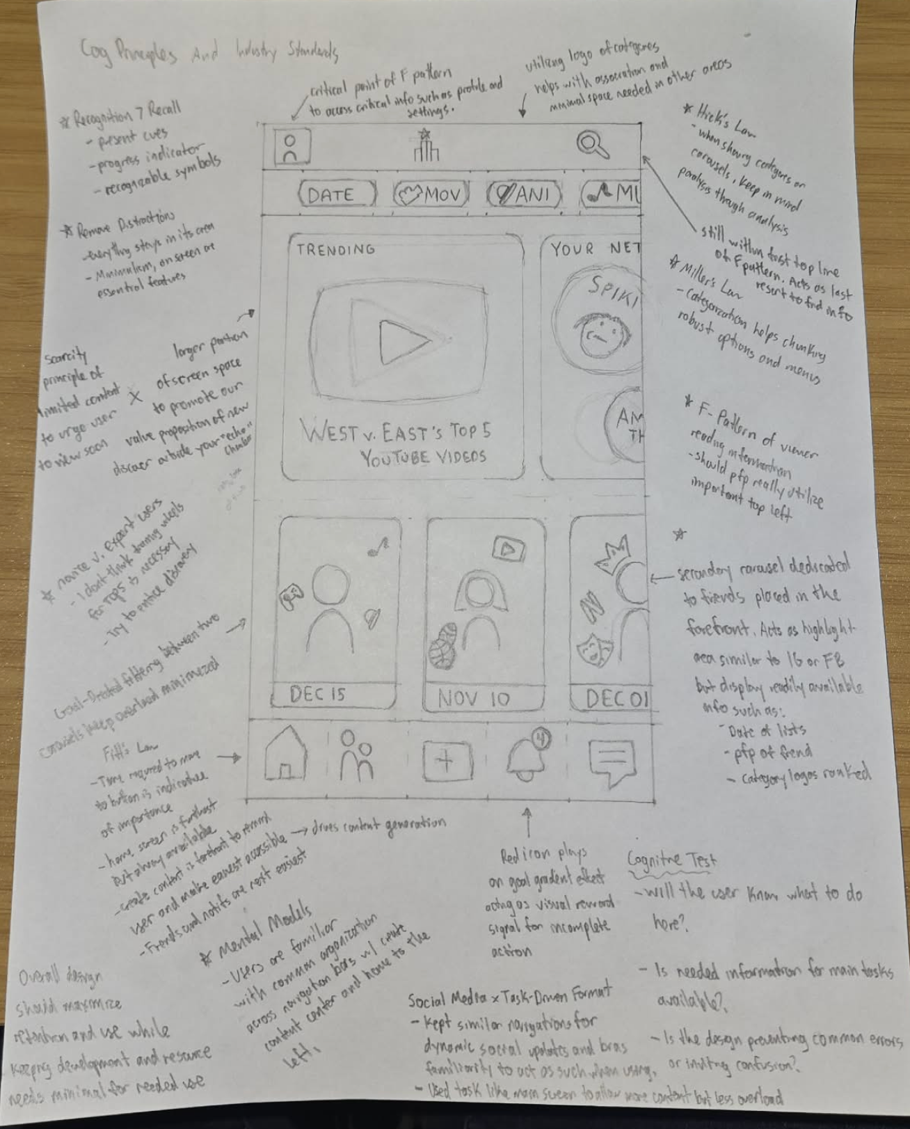
Applied cognitive design principles (Hick's Law, Miller's Law, Fitts' Law) to structure navigation, filtering, and content density decisions
Built a documented design system with WCAG 2.2 accessibility compliance, structured for developer handoff
Other Experience
Signals Intelligence Analyst, United States NavyOct 2012 – Jul 2019
Operated multi-sensor electronic intelligence and warfare systems to evaluate and disseminate time-critical intelligence, providing technical guidance and insights-driven presentations in support of national security and multi-domain military operations
Education
MDes, Interaction Design (Current)ArtCenter College of Design · Expected Aug 2027
M.A., User Experience, Applied Cognitive PsychologyClaremont Graduate University · May 2025 · GPA 3.77
B.S., PsychologyUniversity of Dayton · May 2023 · GPA 3.67
Skills & Tools
Product Development
End-to-End Product DevelopmentFigma Prototype DevelopmentWireframingDesign System
UX Research & Design Methods
Usability TestingUser InterviewsSurvey ProductionUser Persona DevelopmentAffinity MappingQualitative Data AnalysisCompetitive AnalysisSWOT AnalysisCard SortingA/B TestingWCAG-Compliant Inclusive DesignVan Westendorp Analysis
U.S. Navy veteran and mixed-methods researcher turned interaction designer, working across healthcare, AI, and consumer apps, currently pursuing an MDes in Interaction Design at ArtCenter College of Design.
Small Town Raised, Big Dreams Gained
When I initially began pursuing my Master's in UX, my passion was geared toward merging technology with accessibility. My original career aspirations were focused on the cognitive sciences, so naturally, I had ambitious goals to be a bridge that could link the human element to the technological side. This is why my initial case study was 2nd Friend, which regrettably sounds like a cheap dating app. Despite the delivery, this showed my trust in UX as a tool for translating research findings into meaningful designs for those who need them most. Both my undergrad assistantships (Behavioral Activation program & VR detection deception) introduced me to cognitive and philanthropic solutions to assist in this.
However, much has changed since my second month in grad school when I originally wrote this, and I think it harkens back to why I left my hometown and enlisted. Growing up in a small town around Pittsburgh, there were two things I wholeheartedly knew: that I wanted to see the world, and that my parents definitely couldn't afford college. Luckily my older brother joined the Army during my senior year of high school, so I decided to one-up him and join the Navy: the prototypical "just change it up a bit so it doesn't look like you copied" response from a younger sibling.
Seven years later, I was able to live in countries I dreamed of visiting and see places I never knew I would see. Yet best of all, I could finally afford an education, only through a GI Bill, of course. Looking back, my military tenure was something I needed, although it didn't feel like it at the time. I was able to experience food outside of Applebee's hamburgers and meet people other than high school classmates at the local gas station. I fell in love with the world so much that I decided to bring someone back home with me: my wife, Joanna, from Lebanon (who I ironically met in Ohio).
With my crew during one of the deployments that led me here.Still finding new things to discover: sideline access at a Steelers game.
But to get back on track: during one of my seemingly never-ending deployments, I finally figured out my academic passion from some leisure reading on a night watch. A book I ordered from Amazon, Phantoms of the Brain: Probing the Mysteries of the Human Mind by Dr. V.S. Ramachandran, piqued my curiosity for cognition.
Now, studying UX seems like a couple of steps removed from neurology or applied cognitive research, but my instinctive path still tracks all the same. If you look through my portfolio, you'll notice a trend, or lack thereof: my interests bounce around from caregiver assistance to anime curation to financial modeling. Admittedly, the trend is that I just like to learn and love to discover. My passion project, Top5, was chosen much like 2nd Friend, partly for the experience, but mostly for the enjoyment of a different perspective on an already understood problem.
I could've spent this space talking about my ability to conduct empirical research, translate high-level data to stakeholders, facilitate usability testing and think-aloud sessions, or display my Figma skillset with a prototype, but that's what the rest of this portfolio is for. To the few people who make it this far: I wanted to convey a clear sense of who I am and the experience I bring wherever I go, with a further emphasis on my commitment to discovery. I've never seen myself as someone who spends 40+ years in a single career field, but rather as someone devoted to 40+ years of continuous learning. Specialization is typically the result of someone's passion, and mine has no limits.
If you made it this far, you should follow through all the way and shoot me a message.
Role: Interviews, Onboarding Redesign & Visual Layers · Timeline: April 2025 – December 2025
Led mixed-methods user research (interviews + survey data) to inform an onboarding redesign that addresses low activation among Anchovy's recipe-app users.
Research: Interviews & Analysis
Conducted 3 interviews, synthesized against 9 total, using affinity mapping across power users, churned users, and new users. Built an 8-minute onboarding questionnaire alongside a fellow researcher, keeping sessions to an efficient 12 minutes.
Findings:
Liked: shopping list, centralized recipe storage
Pain points: no social feed engagement, no recipe communication tools
Mixed willingness to pay for premium; word-of-mouth remains the top discovery channel
Unique signals: Pinterest as a secondary discovery source, strong performance on auto-imported recipes, appeal to novice cooks, interest in beverage recipes
Business Impact
Metric
Current
Projected
Activation rate (uploaders / total users)
8.3% (250 of ~2,950)
15%
Onboarding completion rate
—
80%+
Current activation trails industry benchmarks (20–40% for successful product-led companies). The 15% target is a conservative projection based on the redesigned onboarding directly addressing the pain points above; the 80% completion target draws on the endowment effect and known progress-bar impact on motivation.
Onboarding Redesign
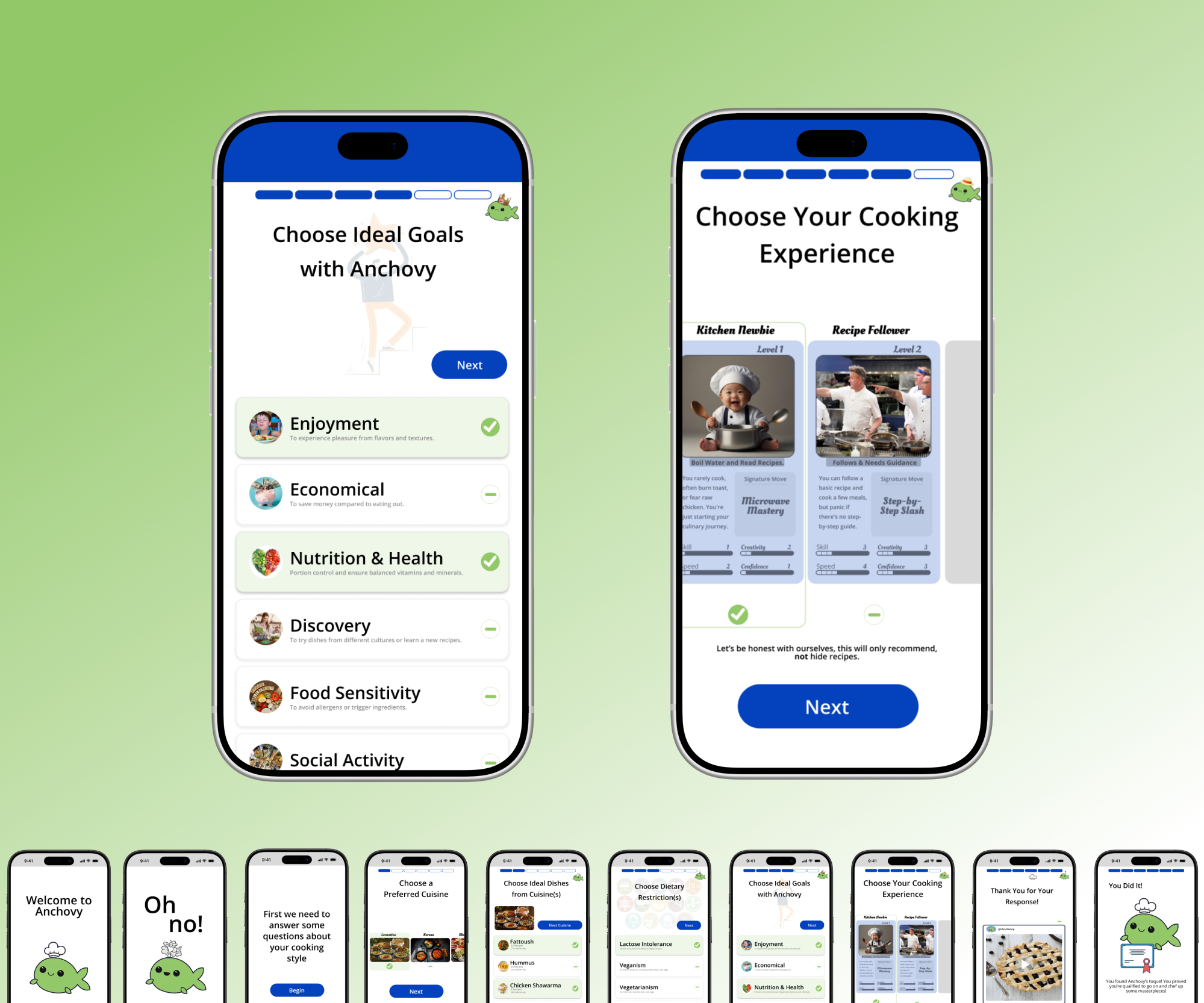
Used Gemini's Imagen to rapidly explore onboarding wireframes, folding in ideas from pre-existing team discussions: preferred cuisine, dietary restrictions, user goals, and "Pokémon-like" experience cards. Mobile-first, generous white space, and fully aligned to Anchovy's existing style guide.
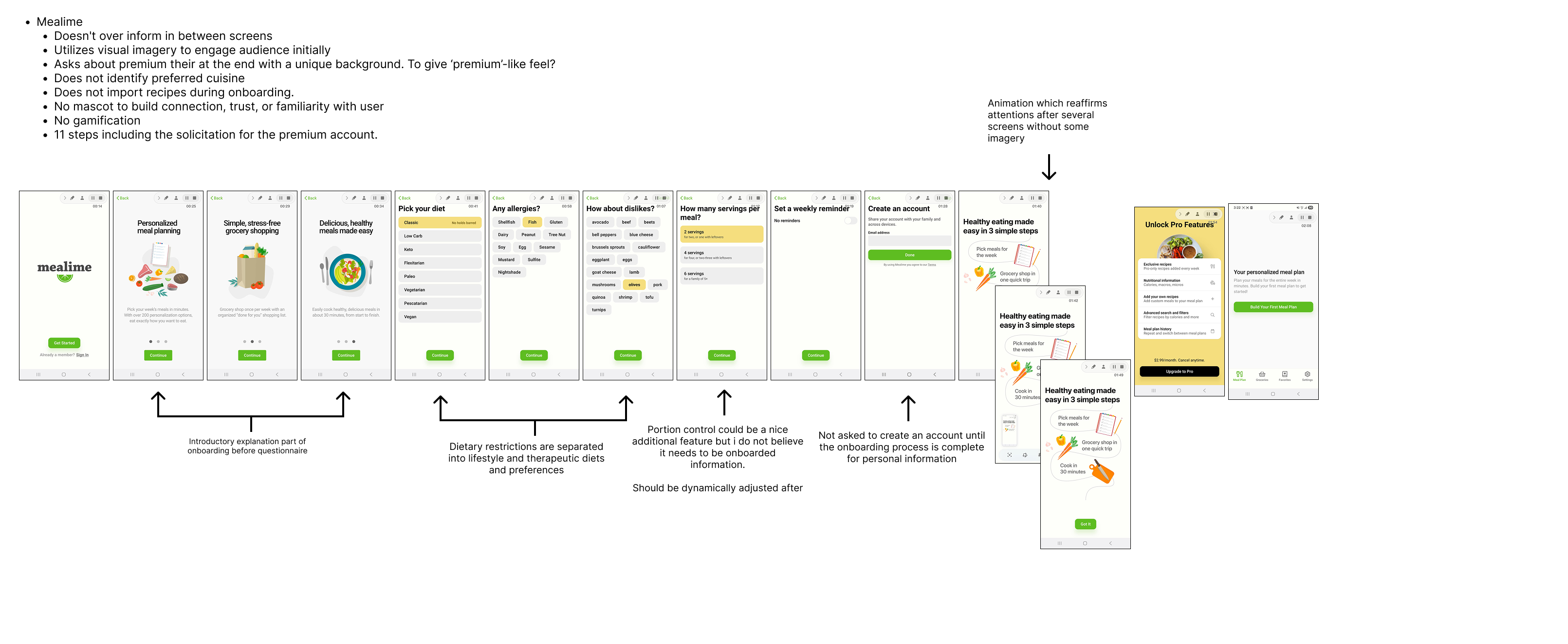
Gamification (9-step flow): a progress bar for momentum, plus a lighter reward mechanic: users help the mascot find its hat, ending in a completion certificate.
Competitive Analysis
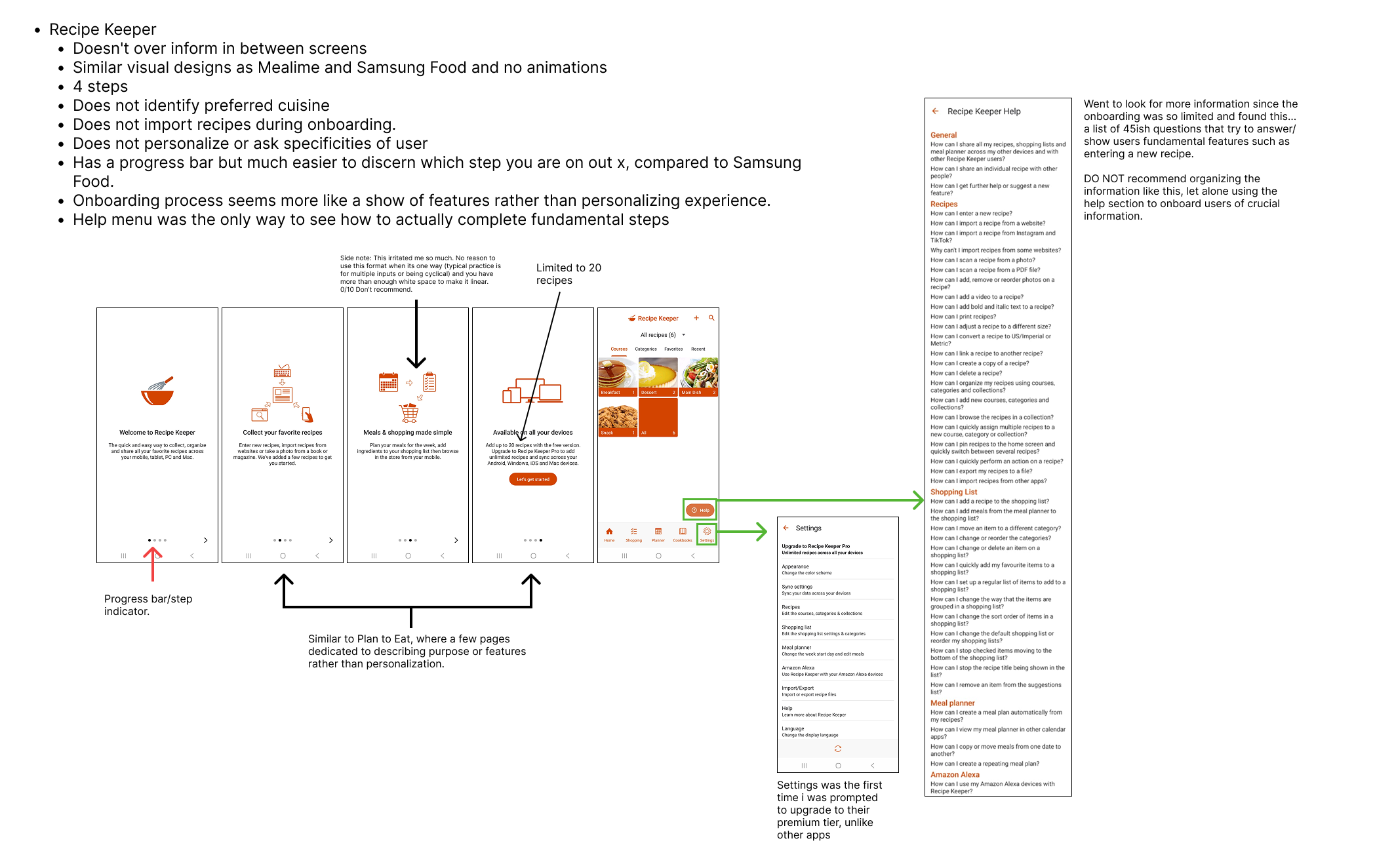
Benchmarked 5 recipe apps' onboarding flows. None identify preferred cuisine or import recipes, and none use gamification.
Interaction Design in the AI Era — This Site & jaytheartistry
Role: Research, Interaction Design & Front-End Development · Timeline: September 2026 · Tools: Claude, VS Code, HTML/CSS/JS
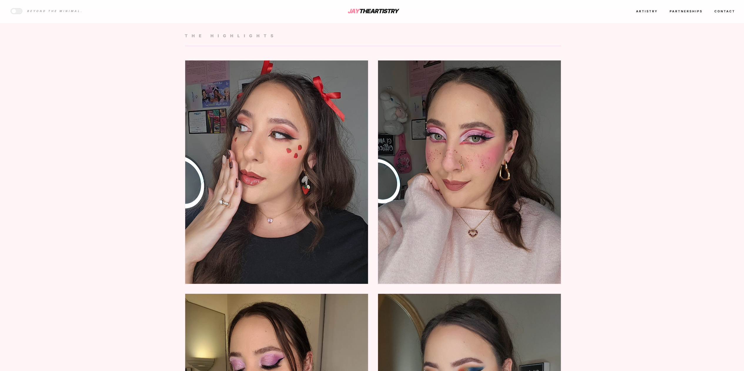
I used this period to test a thesis: that AI-assisted development doesn't replace design judgment, it removes the handoffs that used to separate research from IA from visual design from shipped code — making a research-literate generalist more valuable, not less. I built two production sites back to back to prove it out across very different audiences: this portfolio, aimed at hiring teams evaluating UX rigor, and a beauty-creator site for my wife, jaytheartistry, aimed at brand partners and followers.
Research Before Pixels: This Portfolio
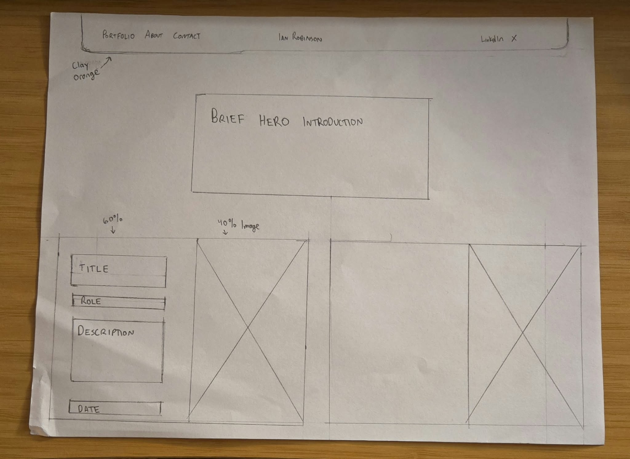
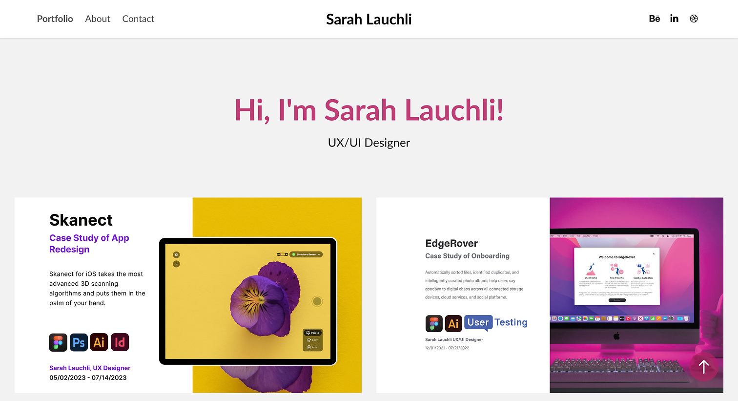
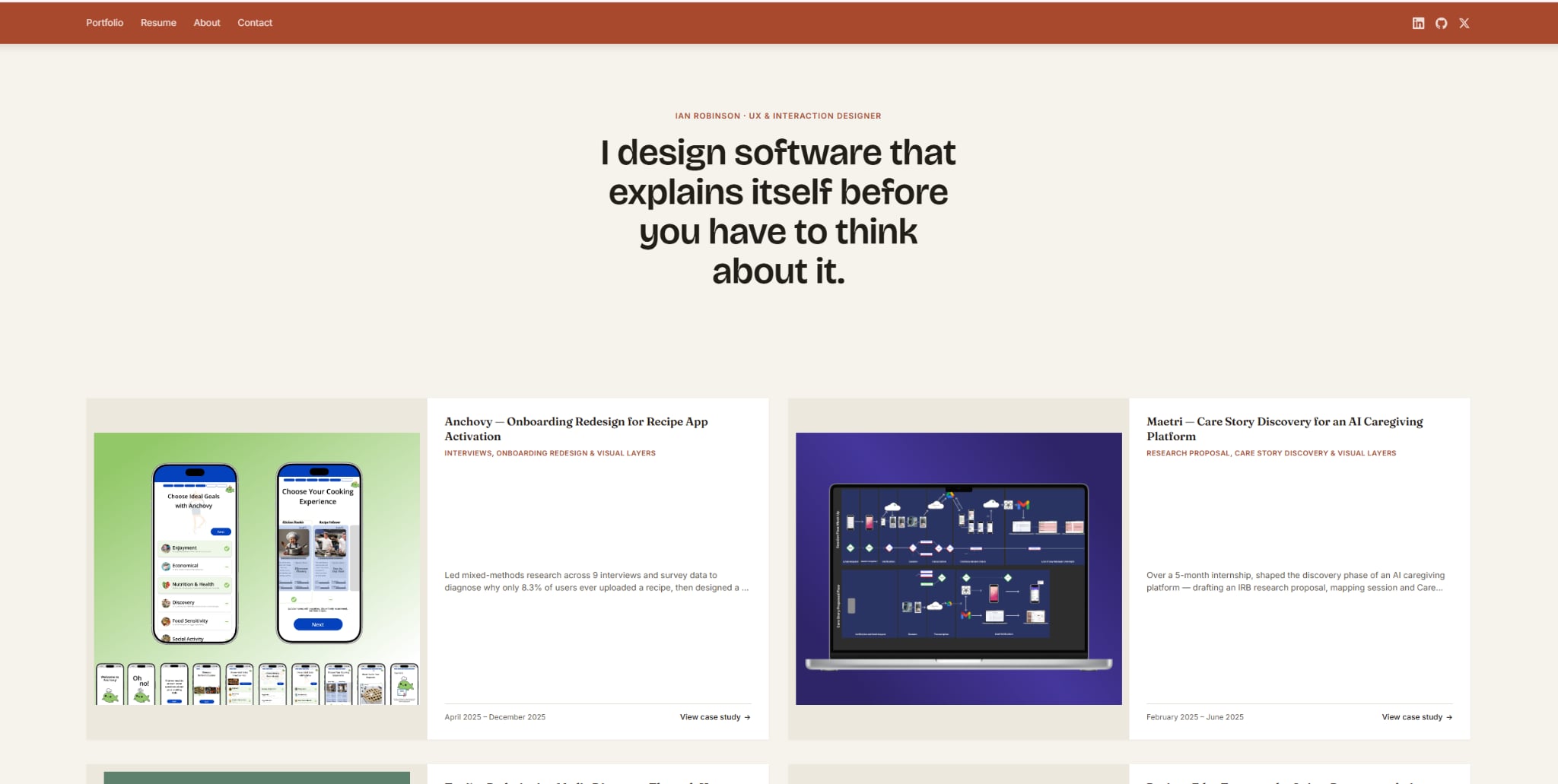
I audited competing UX portfolios for font and card conventions, then annotated my own against them. Three decisions came directly out of that audit: keeping the orange/clay color scheme rather than defaulting to neutral minimalism, since it's a deliberate identity choice, not an accident I needed talked out of; capping the homepage at exactly four case studies, after noting that five is the norm and that an even, "complete-looking" number implicitly signals more intentionality than it technically requires; and leading each case study with social proof and credentials rather than just a name and title — a portfolio with no Sr-level markers reads as entry-level no matter how strong the work is.
The strongest pattern I borrowed: cards that show process, not just outcome — several of the portfolios I liked best used a "journey record" style that previews the thinking, not only the final screen. The pattern I flagged to avoid: text with no defined border or visual boundary, which reads as under-designed no matter how polished the content is.
Codifying the Case-Study Template
Rather than improvising structure case study by case study, the audit became a fixed template every project page on this site follows: Intro/Summary, Role/End User/Duration/Responsibilities, Background, Approach, Discovery & Research, Defining the Pain Points, Ideation & Solution, Implementation, Impact, and Next Steps — five graphics and seven text sections, consistently, so a reader can compare projects instead of re-learning a new layout each time.
Research Before Pixels: jaytheartistry
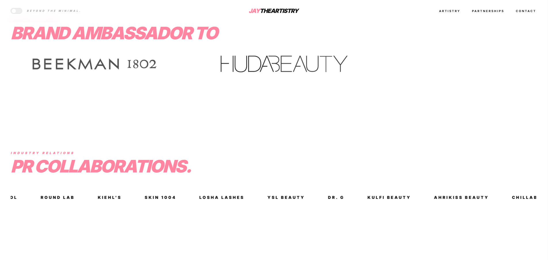
For jaytheartistry, the audit covered beauty-creator and influencer sites to see how they balanced editorial polish against approachability, plus an audit of her own PR history — five years of brand collaborations living in scattered screenshots and DMs — to see what a credible "media kit as a website" would actually need to prove.
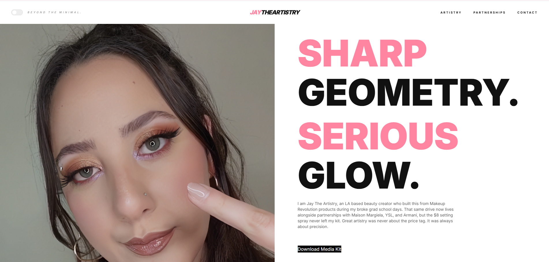
Direct 1:1 references were thin — most makeup-artist-influencer sites that looked the part belonged to full-time professional MUAs, not creators. The stronger reference turned out to be a beauty brand, not a creator: Danessa Myricks Beauty's hero section, a split layout pairing a bold wordmark and headline on a negative-space panel against full-bleed editorial photography. It's built for brands selling an aspirational feeling, not for fast information delivery — which is exactly the register jaytheartistry needed, since the site leans into an over-the-top luxe aesthetic rather than clean, time-sensitive scanning. An earlier pass also referenced Vogue's editorial styling, and deliberately moved away from the "clean girl" minimal-makeup aesthetic — the positioning jaytheartistry wanted was technical artistry, not low-effort polish, to attract editorial and luxury partnerships rather than mass-market ones.
Interaction Design: This Site
The interaction layer is deliberately restrained and justified, not decorative:
Hover-hold magnifier: case-study images use a ring-timer cursor — a progress ring fills over one second before the magnifier lens activates — so zoom is an intentional action, not an accidental hover trigger. A normal click still opens the full-size lightbox for anyone who'd rather just enlarge the photo outright.
Custom cursor affordance: a small accent dot tracks the pointer and grows over interactive elements, giving continuous feedback about what's clickable without relying on color alone.
Scroll-reveal & ghost-word hero: content fades/slides in on scroll, and secondary words in the hero headline sit at low opacity until hovered — a low-cost way to create hierarchy without adding visual noise.
Hash-based routing: each case study is its own addressable, shareable page, built without a framework — just enough engineering to behave like a real site rather than a single long scroll.
Workflow: Research, Design, and Code in One Pass
Working with Claude collapsed the usual research → wireframe → visual → build sequence into one continuous loop: a research finding (e.g., recruiters skim, so lead with outcomes) could become a layout decision and shipped markup in the same session, then get re-tested against the original research goal immediately. The generalist advantage isn't that AI makes the decisions — it's that one person holding the full context end-to-end can iterate faster and catch inconsistencies a handoff would hide.
Stage
Traditional handoff
AI-assisted, single-owner
Research → IA
Researcher hands off a brief
Same session, same person, no translation loss
Wireframe → Visual design
Separate visual design pass
Continuous iteration against the same research notes
Visual → Front-end build
Engineering backlog, re-interpretation risk
Shipped same day, checked against original intent
n
Case: jaytheartistry
The second build was a research problem disguised as a beauty site. jaytheartistry needed to turn five years and 118 verified brand collaborations — PR packages, events, ambassadorships — from scattered proof into a credible, navigable media kit, aimed at both brand partners doing diligence and fans who just want to see the work. Most of this build ran through Google AI Studio, with the final implementation migrated over to Claude; this was the project where I learned how differently two AI tools can shape the same build.
Four Passes to the Final Look
The visual direction didn't arrive on the first try. It moved through a dark, high-contrast black-and-gold "Vogue" treatment, then a softer pastel exploration, before landing on the Danessa Myricks-inspired direction — pure white backgrounds, oversized bold type, a split-screen hero — and finally a second visual register layered on top of it for warmth. Keeping that trail visible, even just in process notes, was deliberate: it's the same "show the thinking, not just the final screen" standard the research audit flagged as a differentiator between senior and junior portfolios.
Structuring Unstructured Proof
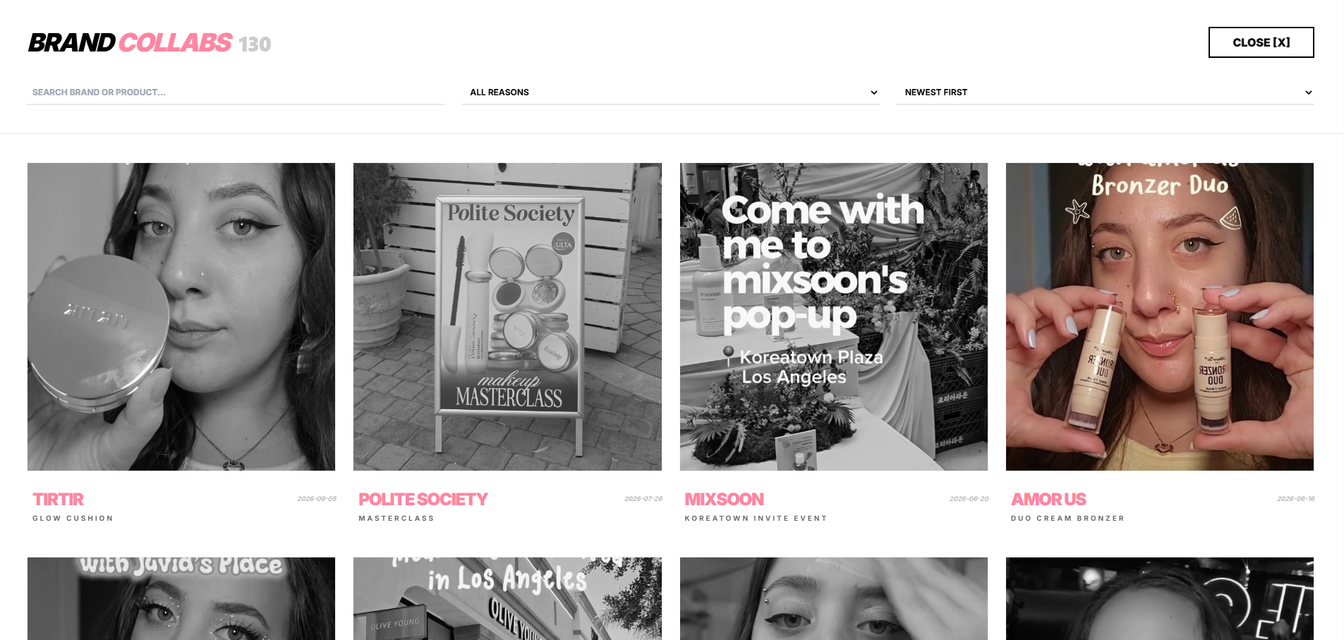
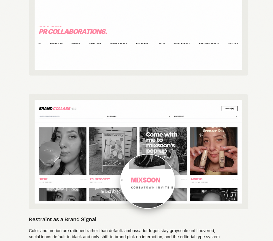
The core interaction-design problem was information architecture, not decoration: 118 collaborations, each with a brand, product, reason (PR package vs. event), date, and linked media, needed to be both skimmable and searchable. The solution is a searchable, filterable archive modal — live text search plus filters for collaboration type and date — so a brand manager can verify a specific partnership in seconds instead of scrolling a feed. Clicking any entry opens a focused overlay with that collaboration's linked media and a direct link back to the original post, so verification never requires leaving the site.
A dual-speed logo ticker separates two kinds of trust signal: a slow-moving row of formal brand-ambassador logos (grayscale by default, color on hover — color is a reward for engagement, not a given) and a fast-moving ticker of campaign names, so scale is felt immediately without the page feeling cluttered. A metrics strip in the navigation — follower count, years active — does the same job in miniature, establishing authority before a visitor reads a single case.
Restraint as a Brand Signal
Color and motion are rationed rather than default: ambassador logos stay grayscale until hovered, social icons default to black and only shift to brand pink on interaction, and the editorial type system — sharp geometry, high-contrast type — carries the weight everywhere else. Reserving color for the moment of engagement makes the few colored accents feel earned instead of decorative.
The one indulgence is the cursor itself — a custom mark that grows and glows on hover — which is the opposite choice from this portfolio's neutral accent dot. Same underlying interaction pattern, tuned to a different brand voice: restrained for a hiring audience, playful for a fan and brand-partner audience.
Outcome & Reflection
Both sites are live and have continued to iterate past launch. The through-line across both: research set the requirements (what a hiring manager needs to trust a case study; what a brand partner needs to verify a collaboration), interaction design turned those requirements into specific, justified mechanisms rather than generic polish, and AI-assisted development meant the same person could own that whole chain without losing fidelity at each handoff. That combination — research discipline plus hands-on interaction design plus AI-accelerated build — is the generalist bet this project was testing.
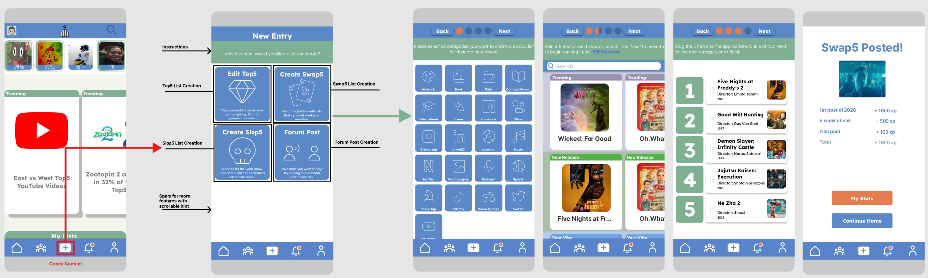
Redesigning Media Discovery Through Human-First Design
Role: UX/UI Designer, end-to-end · Timeline: January 2026 – March 2026 · Tools: Figma, Competitive Analysis, User Research Frameworks
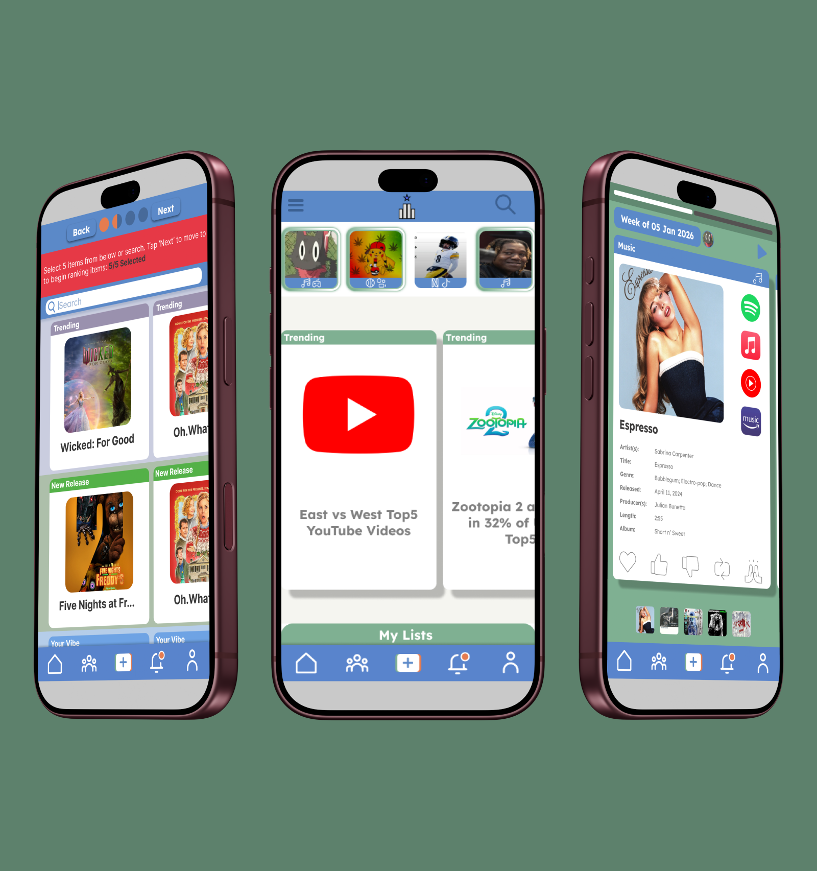
A self-initiated project demonstrating end-to-end UX methodology: from competitive analysis of 17 apps and cognitive-framework development through four design iterations to a complete, scalable design system. Top5 is a social recommendation platform that applies cognitive psychology and constraint-based design to solve media discovery paralysis through trusted peer networks rather than algorithmic engagement.
The Challenge
Problem statement: how might we help users discover quality media recommendations through trusted connections rather than algorithmic feeds that prioritize engagement over authenticity?
Overwhelmed by algorithmic recommendations lacking personal context
Existing platforms excel at community or personal connection, rarely both
Decision paralysis from infinite content options
Disconnection from friends' genuine recommendations
Opportunity: a blue-ocean product combining intimate friend networks with community engagement, without exploitative social patterns.
Competitive Analysis
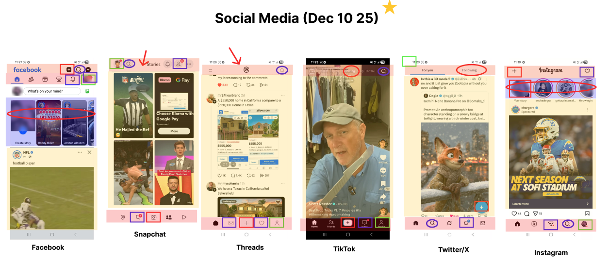
Analyzed 16 apps across 3 categories: task-driven (Amazon, Reddit, Paprika), communication (WhatsApp, Discord, Slack), and social media (Instagram, TikTok, Snapchat). Communication apps limit visual discovery through vertical threading, unsuitable for cover-art-driven recommendations. Social apps converge on the same nav pattern: 5-icon bottom bar, story tray, centered logo, right-aligned search.
Decision: eliminated communication-app patterns (poor visual support) and pure task-driven patterns (efficient, but cold). Leveraged familiar social-media conventions to reduce friction, then differentiated through content philosophy and constraint-based design.
User Insights & Cognitive Framework
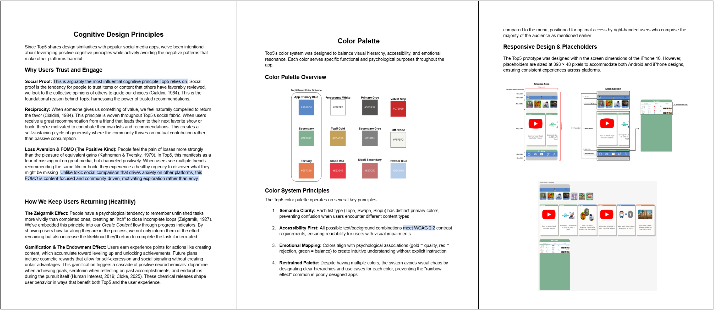
Principles leveraged: Social Proof (peer trust over algorithmic trust), Paradox of Choice (5-item cap prevents paralysis), Reciprocity (great recs invite contribution), Zeigarnik Effect (progress trackers drive completion), Positive Loss Aversion (time-limited content, healthy urgency).
Harmful patterns avoided: no variable-ratio feeds built for doomscrolling, no outrage/comparison bait, algorithmic exploration prioritized over exploitation.
Ideation & Design Iterations
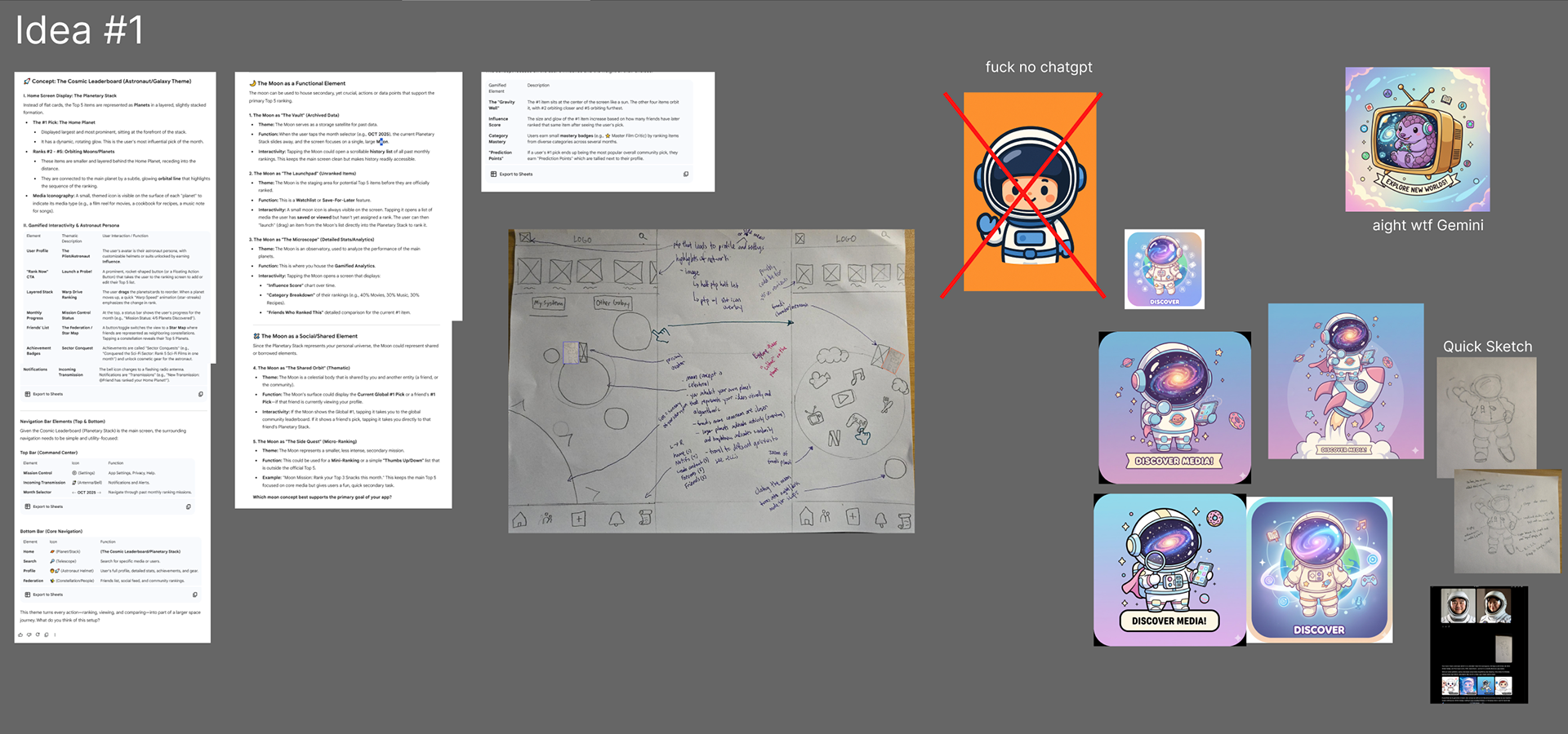
Four concepts were explored and stress-tested against feasibility and cognitive load:
Iteration
Concept
Verdict
1. Space Race
Planets as profiles, galaxies as networks
Powerful metaphor, execution barrier too high for MVP
2. Deck of Cards
Collectible, tradeable recommendation cards
Validated gamification desire, needed dev expertise beyond scope
3. Vertical Carousel
Instagram-style single-list feed
Poor engagement-to-effort ratio
4. Task-Driven (Amazon-inspired)
Horizontal carousels, 70/30 split
Won: multiple options visible at once, confirmed by Hick's & Miller's Law, F-Pattern
The winning concept was refined into v0.1 using six cognitive principles: Hick's Law (filtered chunks prevent analysis paralysis), Miller's Law (categorization aids retention), F-Pattern reading (two horizontal carousels stacked vertically), Fitts' Law (nav placement matches importance), Mental Models (Instagram/Amazon familiarity lowers learning curve), and Scarcity (time-limited content creates urgency without dark patterns).
Design System
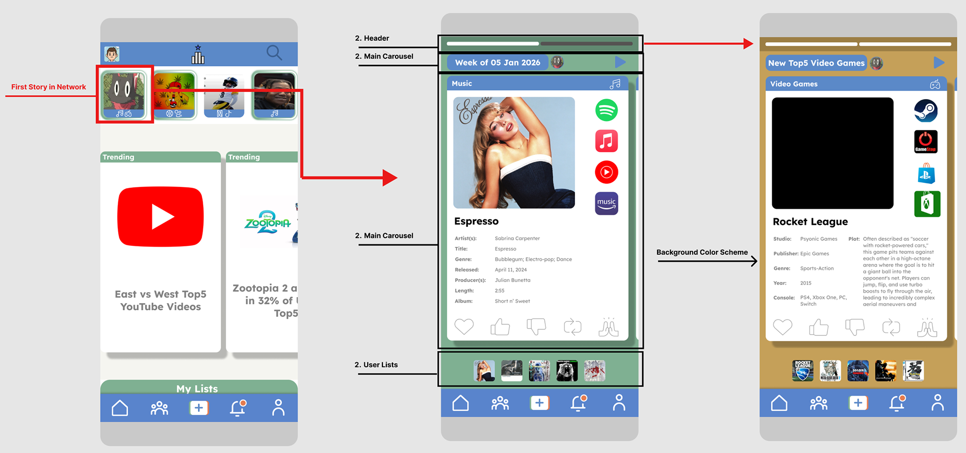
v0.2 matured the validated v0.1 concepts into a development-ready system through three refinements: visual semantics (a color system with psychological associations), structural consistency (8px grid, unified typography), and research-informed navigation (Profile repositioned per cross-platform mental models).
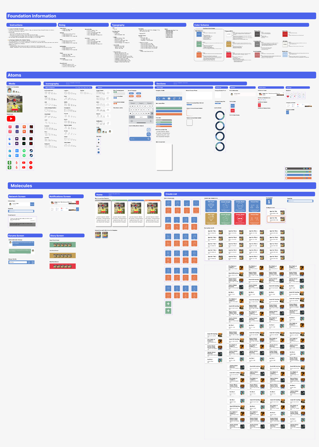
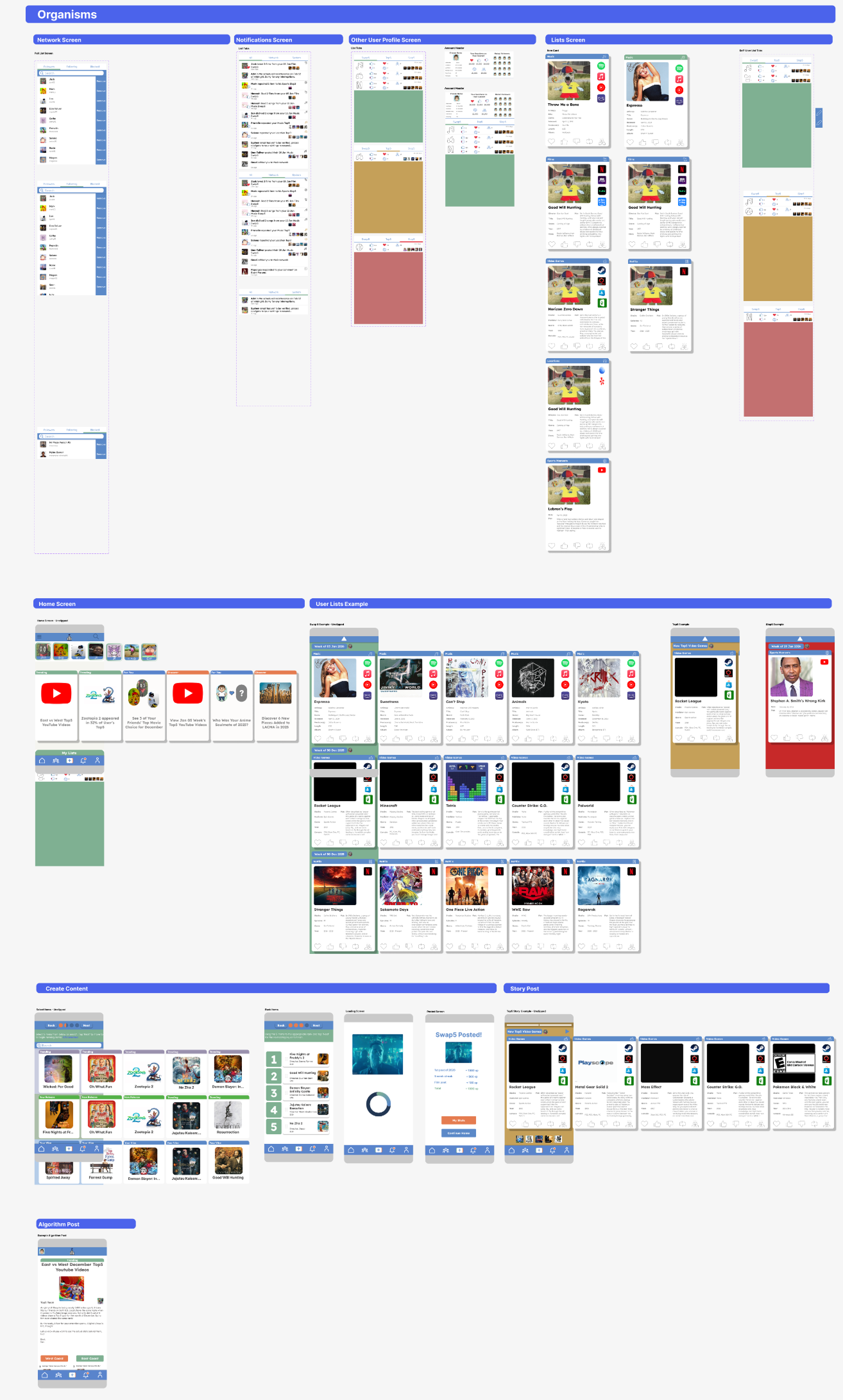
Structure: Atoms → Molecules → Organisms (Frost's Atomic Design), with a Section/Screen/Use/Name naming convention for scalability.
Color: Primary Blue #5B89C8 (trust), Secondary Green #7FB092 (balance), Tertiary Orange #E57C50 (attention). Semantic list colors: Gold (Top5), Green (Swap5), Red (Slop5). WCAG 2.2 compliant.
Type: Lexend, exclusively, chosen for readability and reduced visual stress. Spacing: 8px base grid, 264×82px standardized cards, 40px text safe zone. Icons: Streamline 10,000 (linear monoline).
Key Features & Rationale
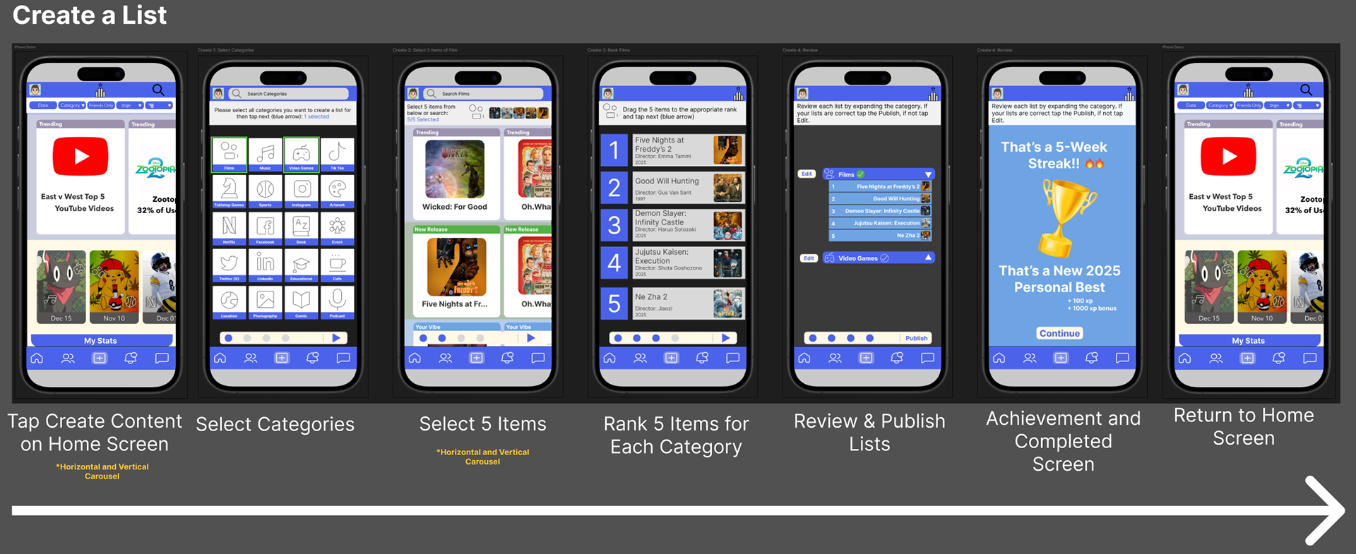
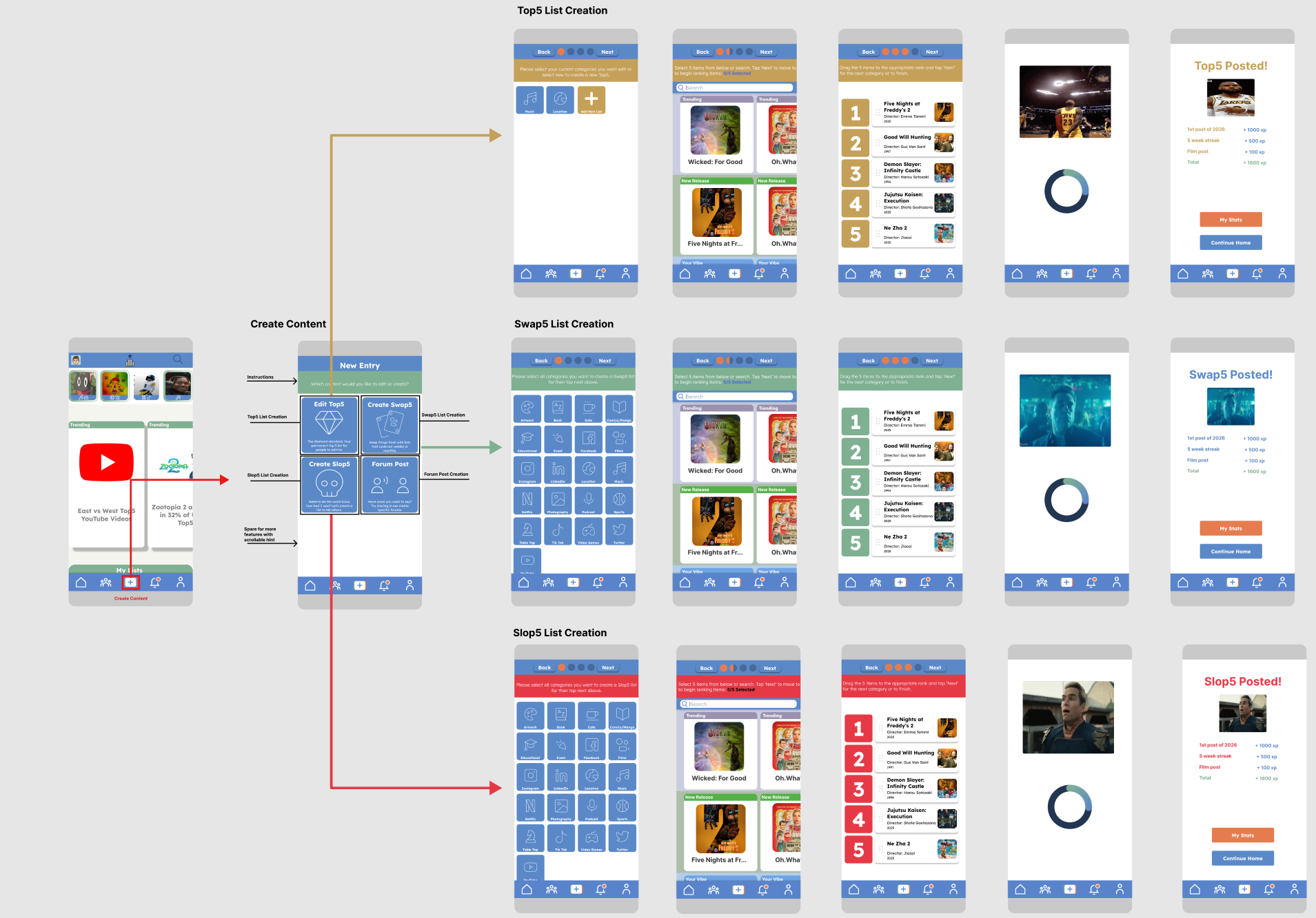
Story Tray: Instagram data shows 50% of close-connection content gets missed in standard feeds; chronological stories with color-coded rings (gold/green/red) fix this. Three list types: Top5 (evergreen), Swap5 (time-limited comparisons), Slop5 (what to avoid). The 5-item cap directly addresses the Paradox of Choice. Exploration over exploitation: monthly resets on Swap5/Slop5 create natural return visits, and research links serendipitous recommendations to higher satisfaction than predictable, filter-bubble suggestions.
Story Highlights: full-screen carousel with metadata and streaming links
Viewing Profiles: top section shows mutual context, bottom section browses their lists
Algorithm Recommendations: discovery carousel weighted toward exploration over echo chambers
Usability Considerations
WCAG 2.2 compliant contrast, with expanded 32–48px hit zones despite 4px visual dot size. Bottom nav placement matters: 62% of users abandon apps with awkward navigation, and thumb-zone placement drove a 38% increase in interaction. Search sits right-aligned for the right-handed majority, and progressive disclosure keeps screens uncluttered.
Core innovation: the 5-item constraint as a differentiator against algorithmic feeds
Demonstrated ability to translate psychological research into shippable design decisions
Reflections & Next Steps
Research surfaces patterns intuition misses: the 5-icon nav isn't arbitrary, it's validated across 16+ apps. Constraints (zero budget) forced better decisions than the more "exciting" Space Race concept would have. Semantic color reduced cognitive load more than expected, and iteration revealed truth: the vertical carousel felt right in theory but failed under real flow analysis.
Next up: rethink the pure-white background (eye strain; moving to off-white #F5F5F0), replace the hamburger menu (poor discoverability), and add algorithmic transparency ("why am I seeing this," confidence scores, feedback controls).
Conclusion
Top5 demonstrates the ability to run comprehensive competitive research, apply cognitive psychology to real UX problems, balance user needs against technical and business constraints, build scalable documented systems, and iterate on evidence rather than assumption. Design should strengthen human connection and respect users' time, not exploit attention for engagement metrics.
Role: Sole Researcher & Designer · Class project, not an official MyAnimeList partnership
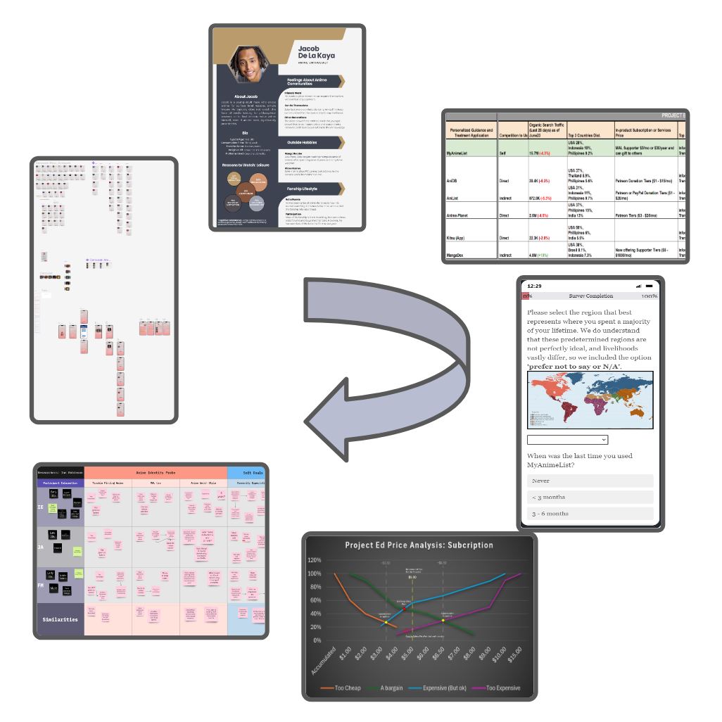
An end-to-end research and design project addressing anime fans' trouble finding trustworthy "similar show" recommendations, built on MyAnimeList's (MAL) database.
Background & Goals
Even long-time viewers struggle to find similar anime without spending hours in comment sections. Goals: (1) build an app that accurately recommends similar anime, (2) validate real demand, (3) ship a Wizard-of-Oz prototype curating MAL reviews against user criteria.
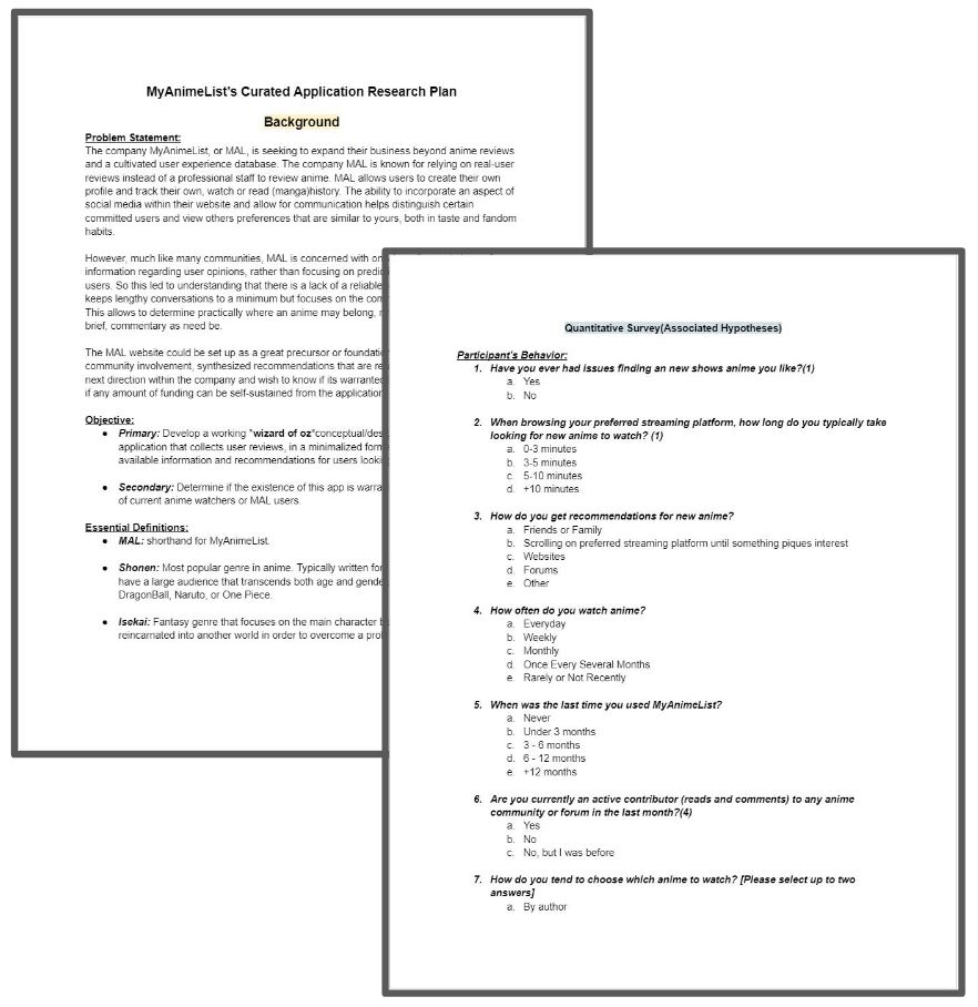
Research Plan & Hypotheses
Delivered a full research plan to the stakeholder: goals, research question, 4 hypotheses, and methodology.
Hypothesis
Test Method
H1: Both new and experienced users want a curated app
Exploratory interviews + Qualtrics survey
H2: Users prefer peer reviews over professional critics
Exploratory interviews + Qualtrics survey
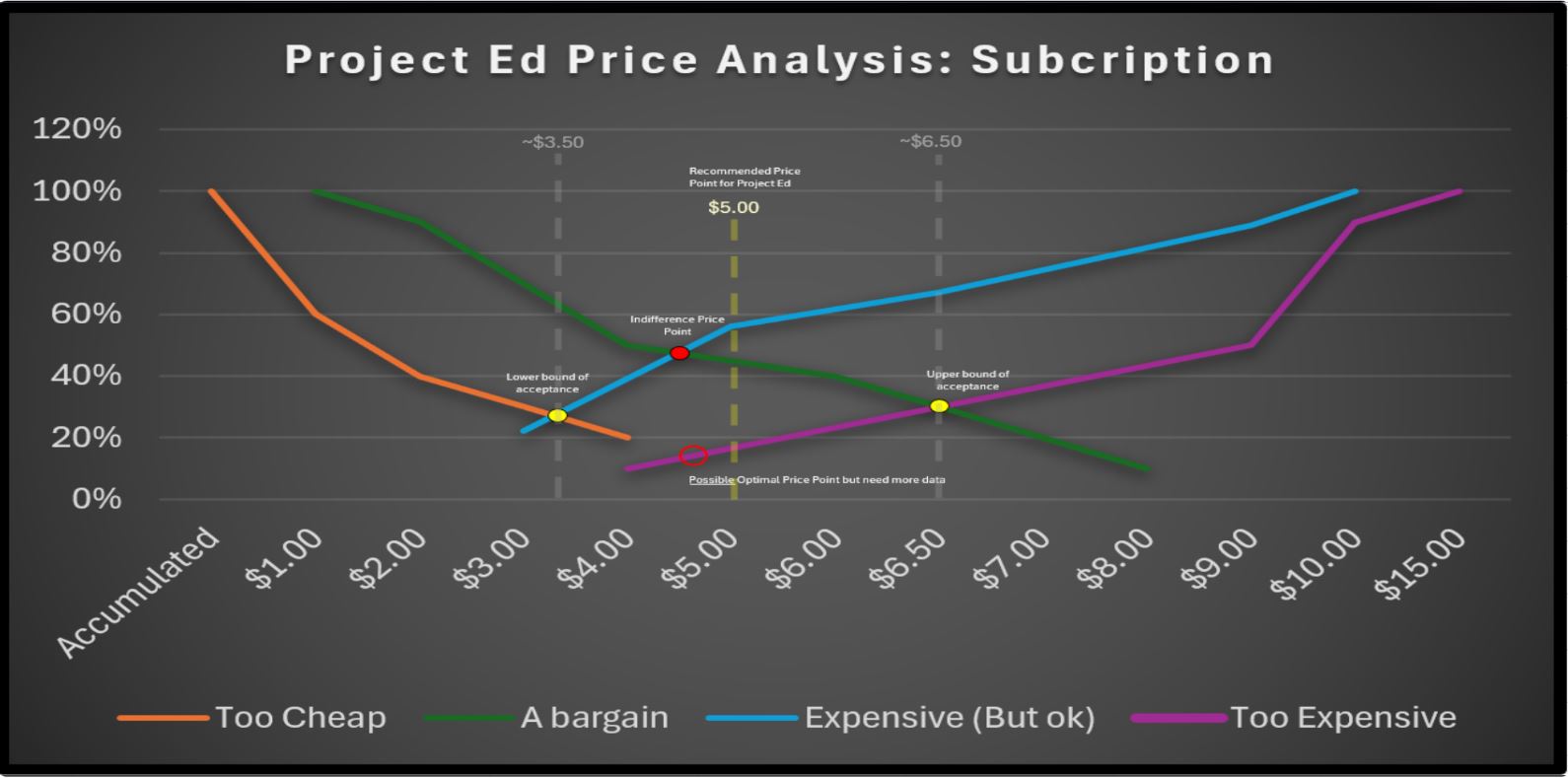
H3: Only a minimal fee ($1–2/mo) avoids discouraging users
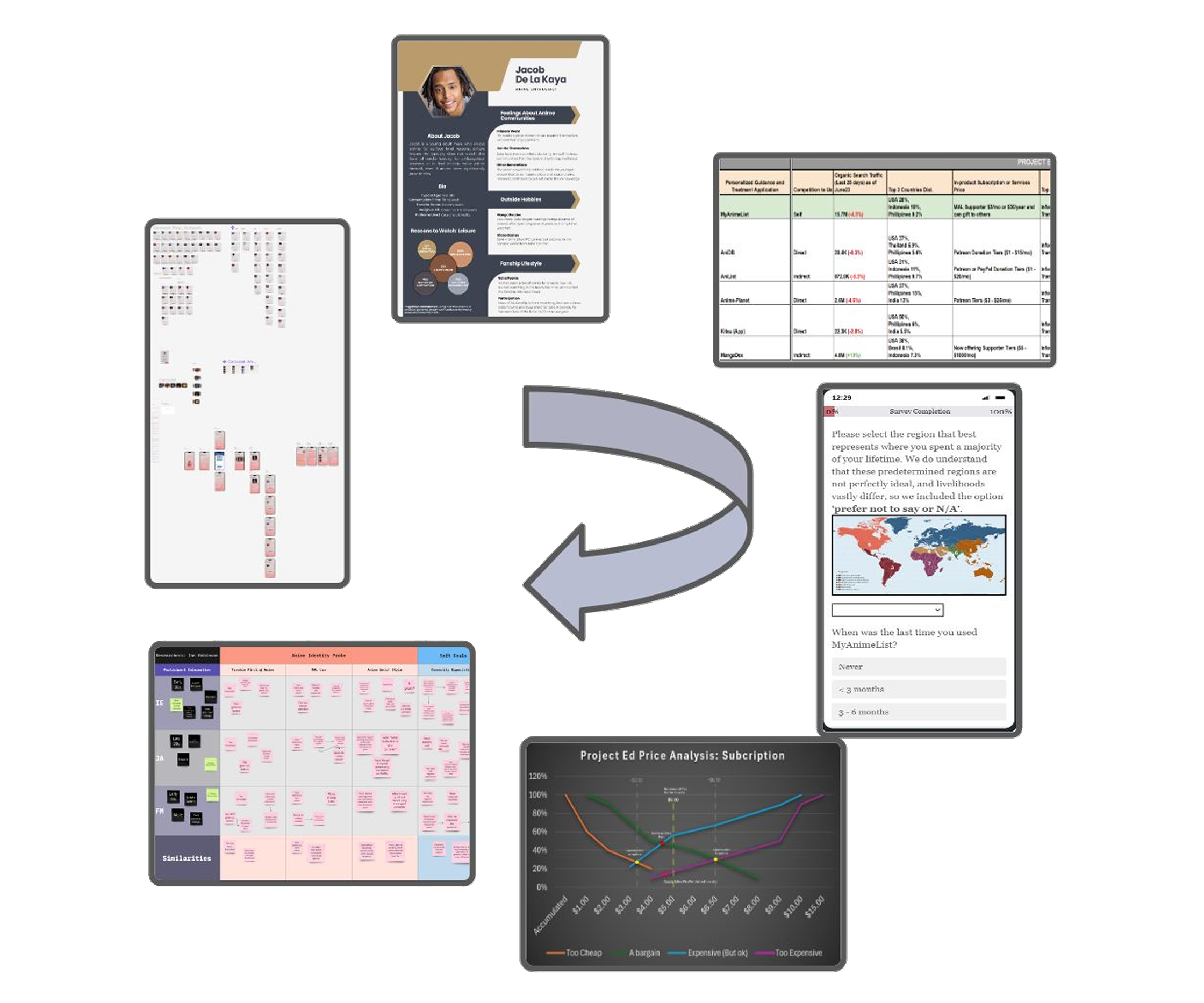
Van Westendorp price analysis
H4: Users will contribute reviews if it benefits the community
Exploratory interviews + Qualtrics survey
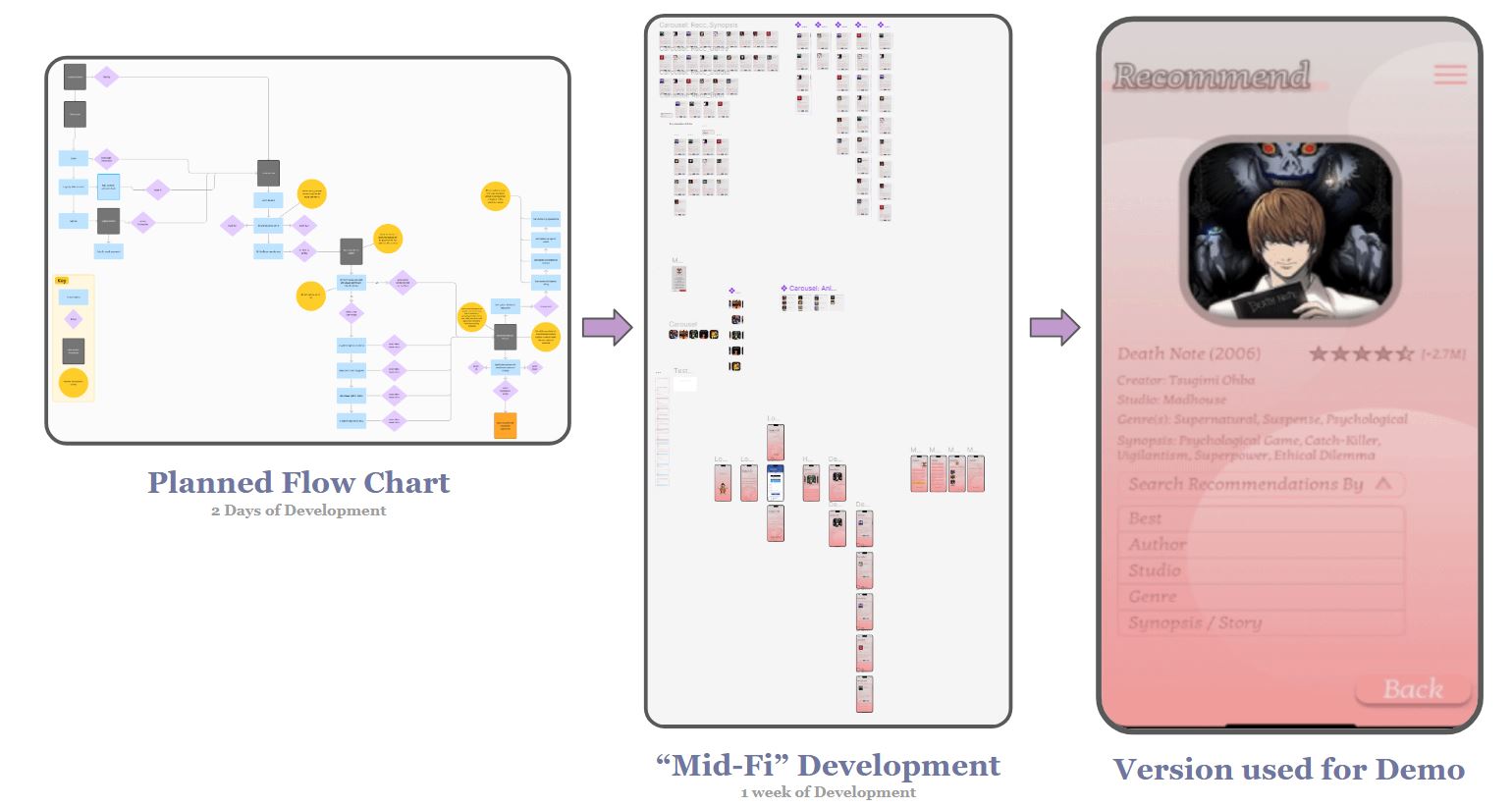
Plus: competitive analysis (5 companies) and prototype testing via proto-persona, mid-fi build, and moderated demo.
Persona & Competitive Analysis
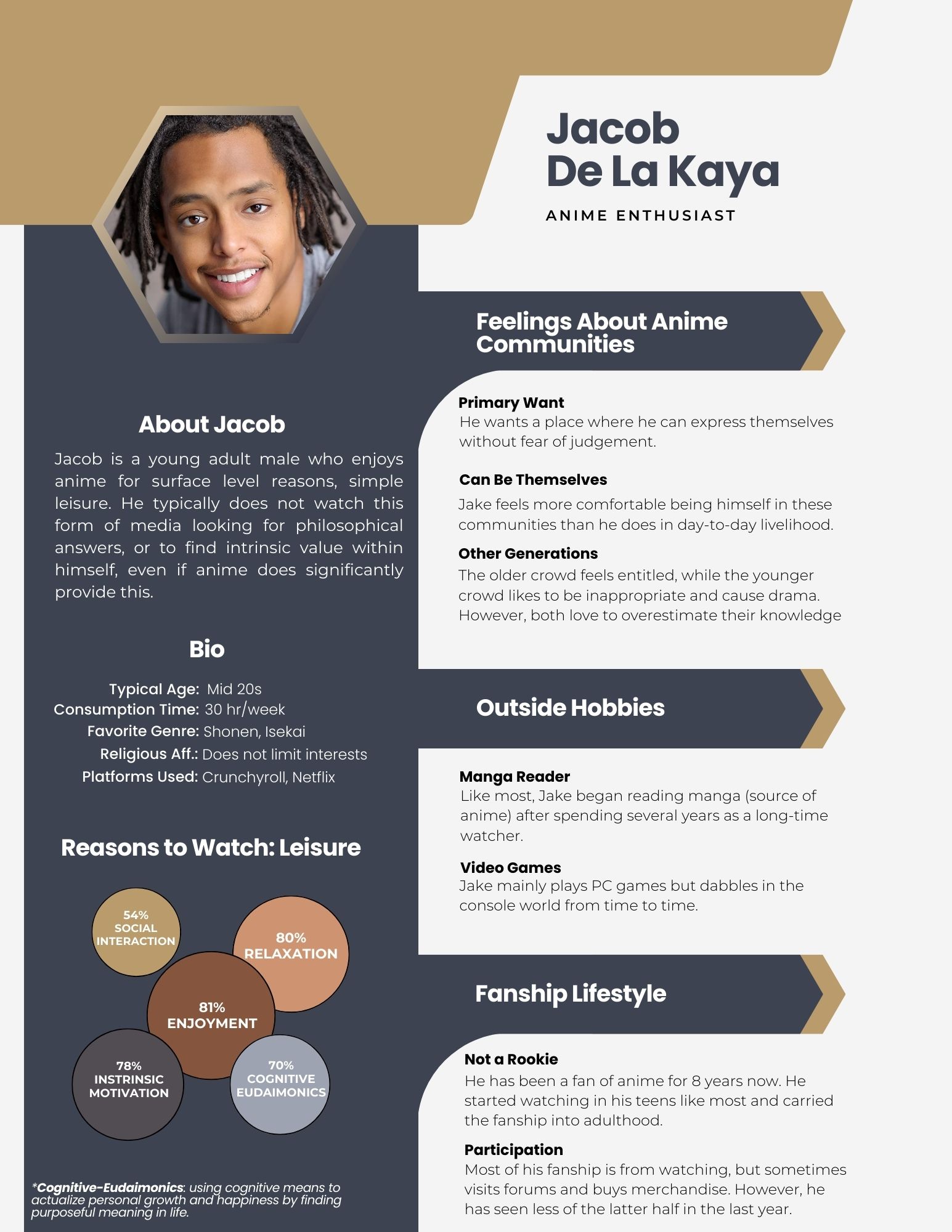
Persona (Jacob): mid-20s casual viewer, ~30 hrs/week, watches for enjoyment over deep analysis, active in forums and merch but not a "power" contributor.
No dedicated curated-anime app exists, so 5 MAL-adjacent competitors were benchmarked (AniDB, AniList, Anime-Planet, Kitsu, MangaDex) across 9 metrics via Semrush: traffic, pricing, keywords, bounce rate. MAL itself leads on organic traffic with a strong bounce rate. Each competitor had a clear gap: outdated UI (AniDB), no real differentiation (AniList), premium-only embedded watching (Anime-Planet), data import (Kitsu), manga-only embedding (MangaDex).
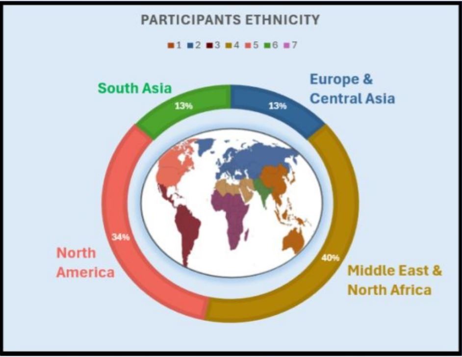
Survey Insights (n=16)
69% struggle to find new anime; 63% spend 10+ minutes searching
63% trust casual-fan reviews despite no professional credentials
63% get recommendations from friends/family; word of mouth dominates
Top choice drivers: genre (35%), story (31%), studio/visuals (9% each)
Pricing: Van Westendorp Analysis
Subscription pricing showed clear, usable price-sensitivity boundaries and was the favored model (69%), likely reflecting expectations of continuous support. One-time-fee pricing produced inconsistent, unreliable intersections and wasn't recommended as a standalone model.
Interviews & Usability Testing (n=3)
International students (Bulgaria, Lebanon, Kuwait) surfaced consistent frustrations: inaccurate anime descriptions/posters, limited access to official streaming in their home countries, and a desire for manga inclusion. Top requests: robust accessibility (including language), less "noisy" low-value comments, and no ads.
Mid-Fi Prototype (built in ~1.5 weeks)
Key features: dual MAL/standalone login, direct links to legal streaming/trailers/MAL, mirrored MAL ratings and descriptions, recommendations by genre/studio/story, and a cleaner anime history log than competitors offer.
Recommendations
Lean on word-of-mouth as the primary growth channel
Continue development; demand for reliable recommendations is validated
Price at $5/month; scale research sample from 16 to ~200 participants
Shift to a gender-neutral persona for more equitable representation
Reduce reliance on official streaming for non-U.S. markets
Ship accessibility options, comment filtering, and minimal ads in the next build
Role: Secondary Research, Redesign & Stakeholder Delivery · Class project, not an official Crunchyroll partnership
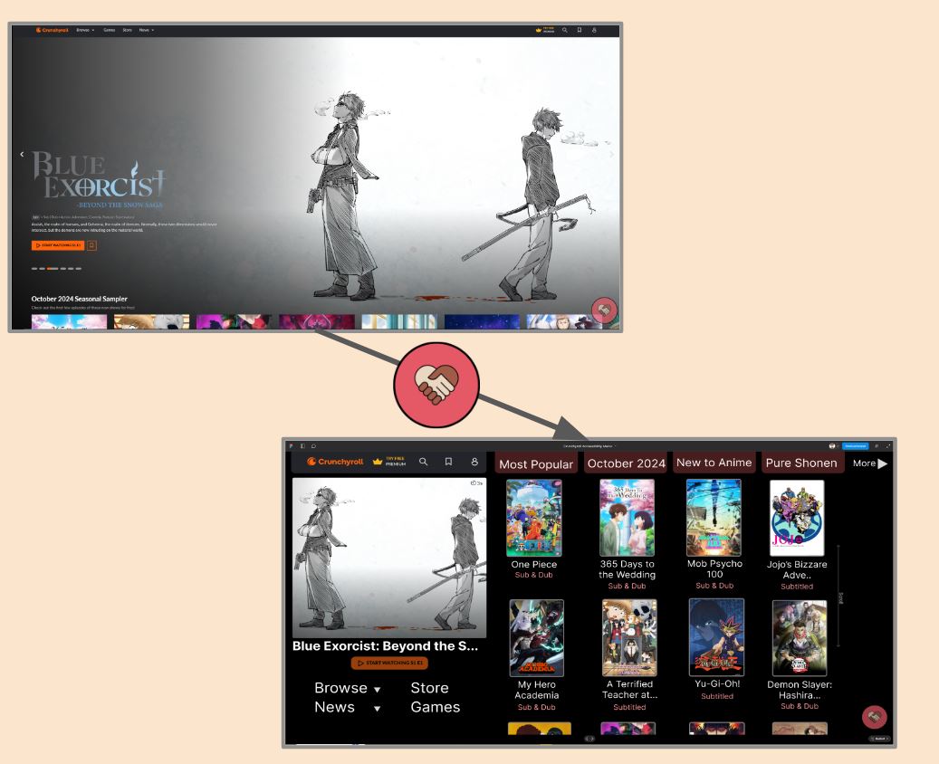
An inclusive-design pass on Crunchyroll's home screen, built from a research-backed persona and WCAG violation audit.
Background
Crunchyroll: 1,000+ anime, 50,000+ episodes, 15M subscribers (June 2024), 5x subscriber growth since 2020, expanding via the FUNimation merger and standalone channels on Amazon/Pluto TV.
Concern: the platform leans heavily on visual displays to drive engagement. Goal: build an optional, inclusive accessibility menu so users with visual impairments can tailor their experience.
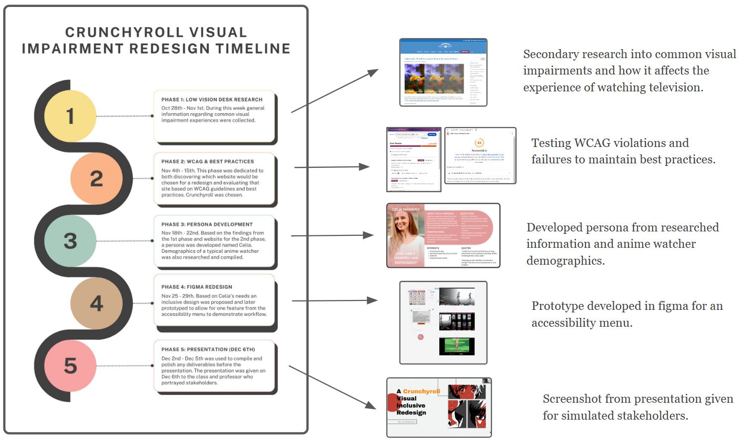
Timeline
5 phases: low-vision desk research → WCAG & best-practices audit → persona development → Figma redesign → stakeholder presentation.
Research & Persona
8% of Americans have some visual impairment. Despite this, anime remains relatively accessible thanks to sound cues and voice acting, yet 96% of visually impaired users still watch TV regularly, and 53% struggle with key visual elements anime relies on.
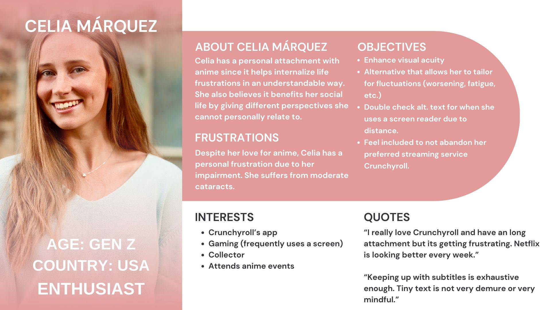
Persona: Celia Marquez, a low-vision anime enthusiast, grounded where to focus the redesign.
Why Redesign
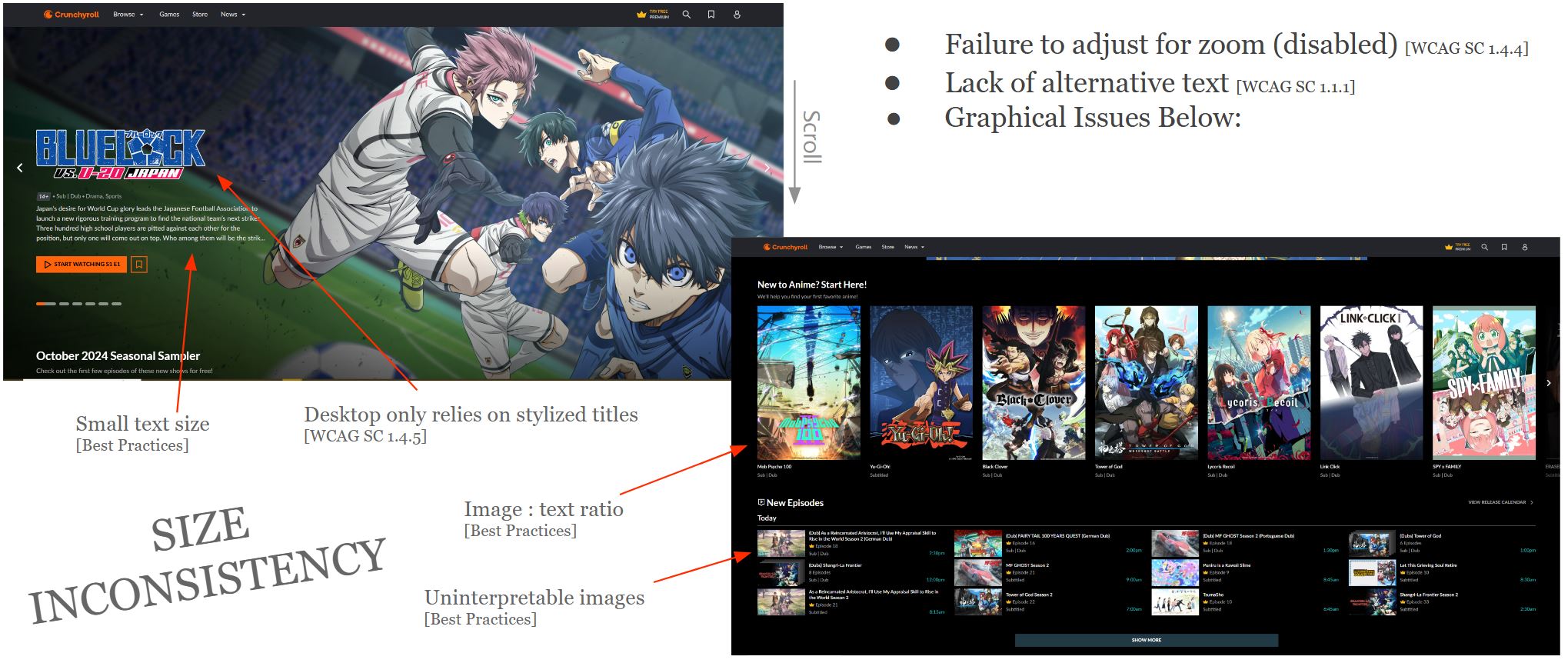
Crunchyroll prioritizes visual excitement over readability: stylized titles, inconsistent sizing, and WCAG 2.0 violations. Google Lighthouse and Accessible Web Helper audits, cross-checked against Celia's needs, surfaced: failure to support zoom, missing alt text, inconsistent sizing, and low image-to-text ratio.
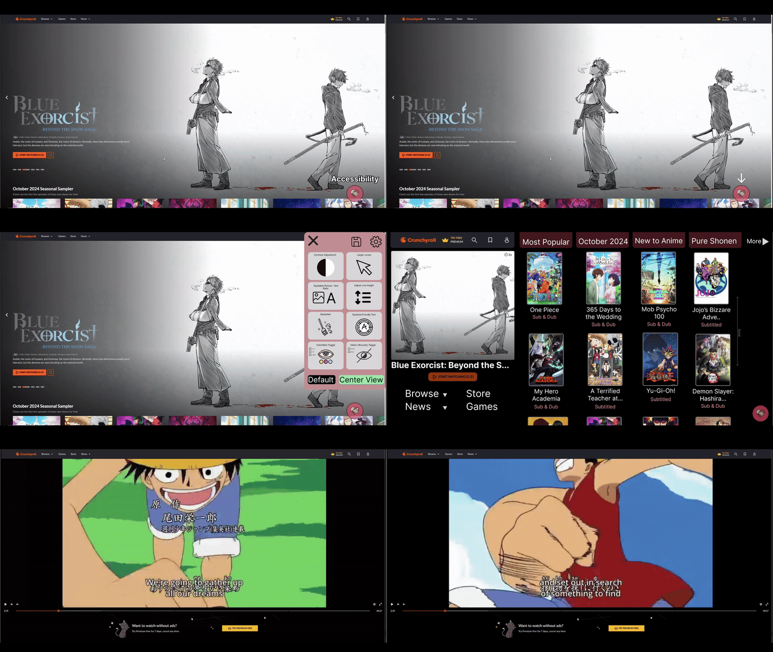
Prototype & Changes for Celia
Built on the industry-standard accessibility-menu pattern, with four targeted fixes:
Change
Problem it solves
Legible titles
Stylized text made shows hard to identify
Even column grid
Inconsistent sizing forced constant re-zooming
Equal image/text sizing
Small text required zooming even in "Top Picks"
Larger description text
Descriptions matched the smallest, hardest-to-read text on hover
Conclusion & Next Steps
Learned: designing for one impairment is hard to generalize, especially with little formal UX literature on the topic, and Crunchyroll is a challenging read even without a visual impairment.
Gaps: the accessibility menu's placement risks being missed by users with peripheral vision loss; only the image-to-text option was fully prototyped.
Next: usability testing (an underserved area for low-vision UX research) and building out the remaining accessibility-menu options.










 CompAnal.png)


 n
n